UX/UI Design
Case Study
enterprise web application
The Problem:
Improve the findability of self service features for users within the dental provider portal.
My Roles
Product Designer
Timeline
2 week sprints per feature
Team Size
I worked alongside two product owners, a scrum master, and a team of six developers
Tools
Axure RP 9,
Illustrator,
React framework component library,
Jira,
Confluence
Methods
Stakeholder Interviews, Competitor Analysis, User session recording reviews, Voice of the customer feedback, Personas, Heuristic Evaluations, Prototyping
Creative Process
Several features were iterated upon, including better portal navigation and the ability to easily sort large amounts of nested data from a database in a self service portal.
When I came aboard the project, the product owners had already refined several user stories within the teams’ Jira. Detailed functionality and UI solutions were presented with user stories, but the users problems had yet to be identified. Unfortunately, no user interviews had been conducted up to this point and we did not have access to our users. I conducted a heuristic evaluation, competitor analysis, cultivated a group of similar users from LinkedIn to interview, and analyzed a statistically significant amount of user session recordings to identify the underlying customers’ problems.
PHASE 1
Met with the product owners to understand the product and what they knew the problems to be, mapped the site architecture, collaborated on prioritizing user stories, conducted a competitive analysis and primary research, developed personas, performed card sorting activities, and analyzed user session recordings.
PHASE 2
Met with the developers to understand technical constraints and iterated on user stories and created user flows.
PHASE 3
Created conceptual ideations and modeling, produced Lo-Fi Wireframes to test user flows, feedback and testing led to reiterating in greater fidelity. Development ran concurrently with the design phase.
PHASE 4
Conducted analysis of ADA and QA on development deliverables.
Core Features
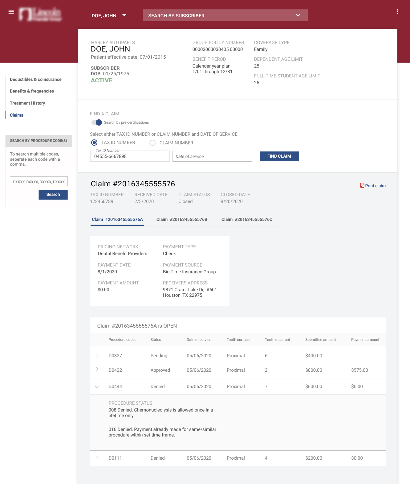
Core pages and features we identified for the reiteration of the minimum viable product were: improved portal navigation, improved task flow for users trying to conduct claims searches, and an easy to digest grouping of patient data.I utilized a material design table with a simple data layout in order to minimize visual clutter of large amounts of data. The results of a procedure code search needed to be referenced on multiple pages, so I implemented the procedure search in the sidebar. I emphasized the subscriber drop down and a search by subscriber option at the top of the page to give users easy access to conduct a search on more than one subscriber.
Easy to navigate
Responsive design
Flexible data solution

THE RESEARCH
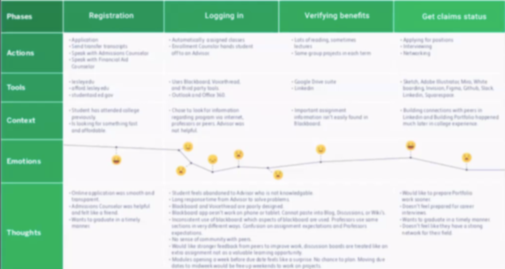
Research methods were chosen based on project timelines and limited access to customers. Initially, high level themes and areas to target were identified by analyzing voice of the customer surveys through Qualtrics. Recorded user session analysis and market research were used understand the market and the users. A journey map was created to track users progression through the product and to identify what users to focus on for the personas.
Hypothesis:
Users expect a claims status search to be located within the verification of benefits.
After forming a hypothesis, six proxy users (third party insurance brokers, between the ages of 35-40) were interviewed to better understand the deeper problem and whether we were solving the right problem. True intent and usability questions were asked of the participants to understand where and how they access the portal. General questions about what tasks they usually performed, where they expected information to be on the portal were asked as the moderator observed thier behaviors. The high level themes from the interviews were: “uncertainty about which action to perform first,” “A lack of context for their claim search,” and “responsive design issues.” From these interviews an affinity map with variables were created with each of their responses plotted, culminating in a persona.
User Experience Research
Research included collecting and coding user session recordings, card sorting with a user base similar to our actual users, and analyzing the voice of the customer feedback.
Takeaways
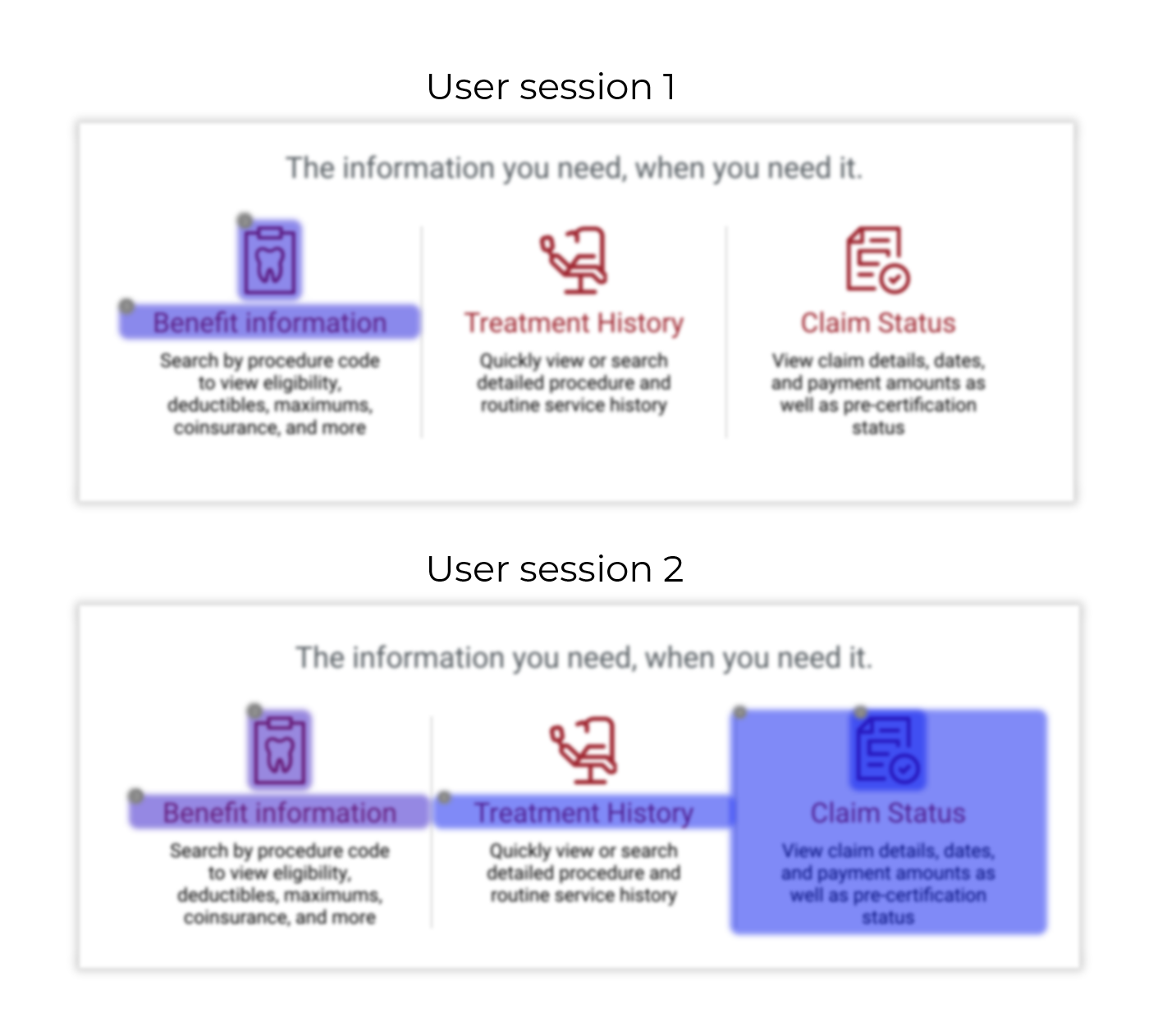
The newly designed Dental Provider Portal performed well against the metrics set for it. However, on a deep dive into user behavior, there were many points of friction that began to snowball into a troublesome user experience. For instance, the landing page for the portal had icon heavy marketing blurbs and rage clicking was witnessed as users mistakenly clicked on the marketing copy instead of the navigation to locate the feature they wanted.
Card Sorting
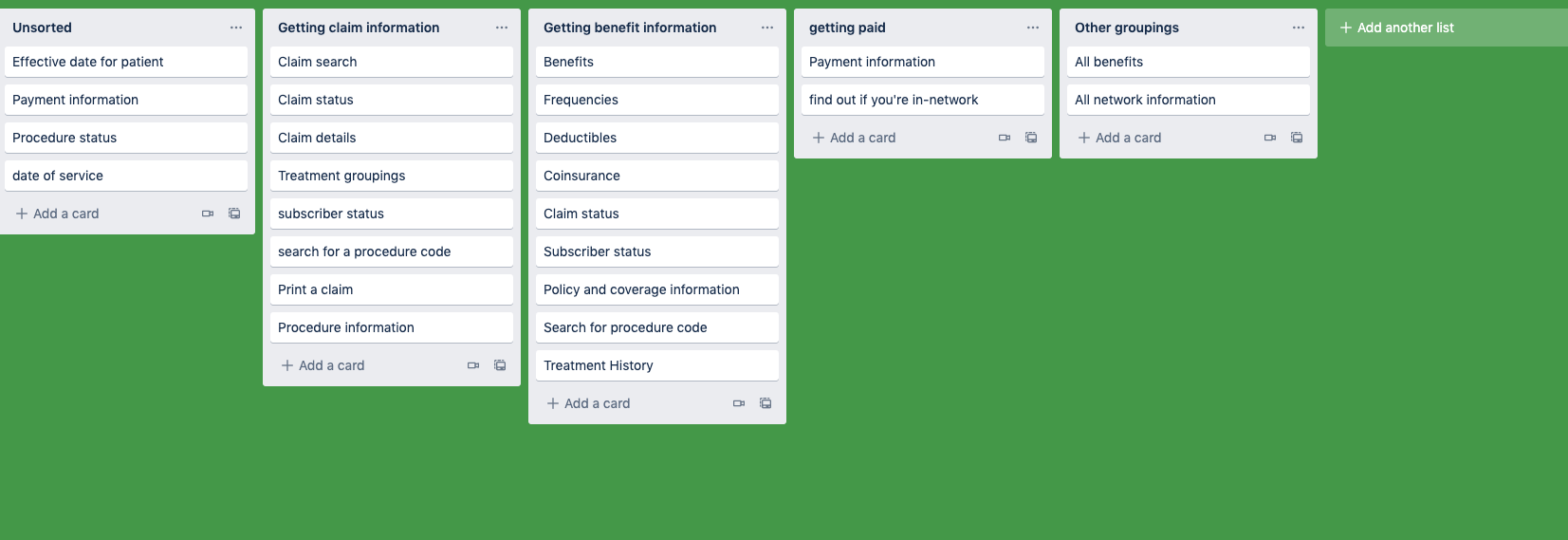
Interviews uncovered the problem to be an information architecture issue. Card sorting activities were carried out with our proxy users to understand where they expected to find each piece of the benefit and claim process. An open card sort via Trello was used to clear away the assumptions the team had made in the MVP of the product and set a new baseline moving forward for the structure of the portal.
Takeaways
I chose Trello because it served our needs, minimized cost and saved administration time and effort. One reason I chose Trello over Optimal sort was due to the red tape involved, I had to schedule meetings with another team and wait for them to set up the tools.
UX Design
Several solutions were tested to identify if claims within the verify benefits page was faster and easier to find compared to the original design. The semantic metric filter of “excessive cursor” decreased from 255+ recordings to 35 recordings.
Takeaways
The user session recordings showed a common behavior where people performed a verification of benefits search from the landing page. On the verification of benefits page there was a higher amounts of vertical scrolling activity in opposite directions than usual, dead clicks, and rage clicks until noticed the claim status link in the header navigation. 17% of users expected a claim status to be visible under the verification of benefits.
Another aspect of the original design that added friction to the user experience were the link heavy headers utilized by the client. Users in my interviews indicated these headers were confusing. I concluded any portal navigation needed to be separate from the brand navigation.
Task flows and information architecture
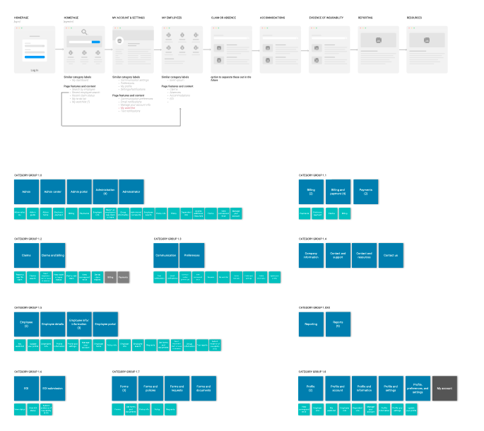
Reiterating
The page took several iterations as I attempted to work within the constraints of what was already developed. Progressing through the work I discovered that a piecemeal approach had been taken for adding features and functionality and it became clear that a holistic approach was necessary. I compiled a powerpoint presentation tailored for the product owners to demonstrate my findings and the insights I gleaned.
REFLECTION
PROCESSES
While the company had a UX guild, there were no clearly defined assets or processes in place when I started the project. A lot of time was spent developing a map of the systems, features, and user journeys that impacted the product. I had to get creative with my user research and interviews and rely on cultivating resources on LinkedIn to try to validate my observations.
I was fortunate to work with an extremely agile mature development team and we were able to save time by working from high fidelity clickable wireframes. I identified and developed methods of transparency so that product owners could understand the process and development of UX, as well as ran design sprints with developers and product owners to improve cross-functional team alignment.
OPPORTUNITIES
Working on projects for this client helped me better understand the importance of UX and the value it brings. One realization was that the efficiency of MVP reiterations could have been improved if time were spent getting the right resources in place to conduct appropriate research. Additionally, product owners were under a lot of pressure to hit PI objectives and sprint story count estimations, so when the product owners pushed back against a solution or research and testing, I employed my skillset to empathize with them to unearth where their concerns were coming from so that I could get them on board while ensuring the product remained user centered.

