UX/UI Design
Case Study
EASYODDS SITE mobile first site REDESIGN
The Problem:
EasyOdds is a UK based odds comparison app where users compare real-time prices from all the top bookmakers and have the ability to place bets directly in app for each game. Easyodds was founded in 2000 and we were tasked with updating their user experience and UI for desktop and mobile.
My roles
UX researcher
Interaction Designer/UI
Timeline
7 months
Team size
In house we had 2 team members working on the project.
Tools
Sketch
Invision
Methods
Market Research
Stakeholder Interviews
Competitor Analysis Affinity Maps
Personas
Heuristic Evaluations Usability Testing
Card Sorting
A/B Testing
Prototyping
Creative Process
We worked alongside EasyOdds developers and managers to better understand the industry, users, and their product. With access to the existing website and the customer data as a research starting point, we used IDEO’s Human-Centered Design and an Agile development process to ensure our solutions were aligned with user research and user empathy
The EasyOdds site experienced a decrease in users and usability was considered to be the problem. We utilized monitored user testing, visitor intent poll, and user feedback polls. Our quantitative methods were scrolling behavior heatmaps, click behavior heatmaps, and user recordings. For usability we conducted heuristic evaluation, competitor analysis, and user acceptance testing.
PHASE 1
The EasyOdds team supplied us with access to their internal development work and business requirements. After developing a Scope of Work, we conducted a competitive analysis and usability testing.
PHASE 2
Based on the qualitative and quantitative data, we created affinity maps and personas.
PHASE 3
Using the existing website as a springboard, we generated Lo-Fi Wireframes to test our hypothesis, and with feedback iterated greater fidelity.
PHASE 4
QA on the developers deliverables of our design.
USABILITY ISSUES
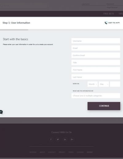
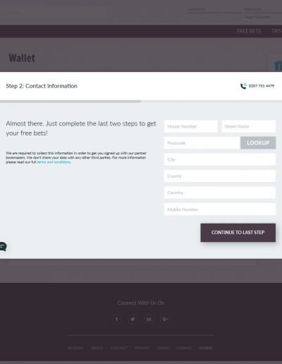
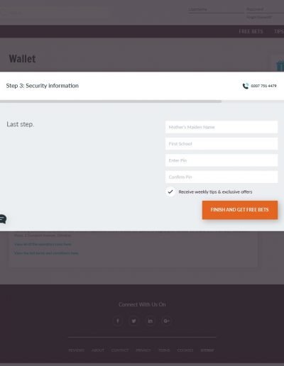
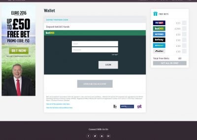
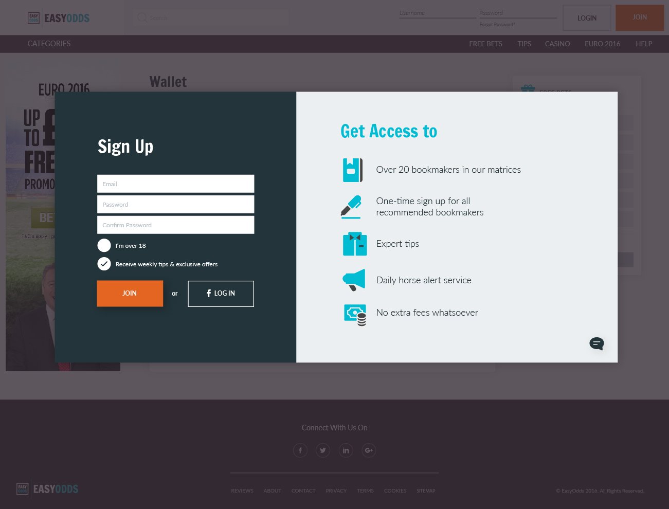
Following user testing to investigate the overall customer experience of the app it became apparent that the signup process and the odds comparison matrix suffered from complexity issues. The UK legally requires a lot of information from users on betting sites, on top of this bookmakers have different requirements for signing up with them as well. If a user wants to place bets through EasyOdds with a bookmaker, EasyOdds has to satisfy the requirements of all these various entities upon initial sign up.
Clarity
Focused Interface
Expanded Bet Functionality

User Experience Research
- Users were not clear on what actions to take when first landing on the website, we incorporated on the home screen a section to direct them through the process.
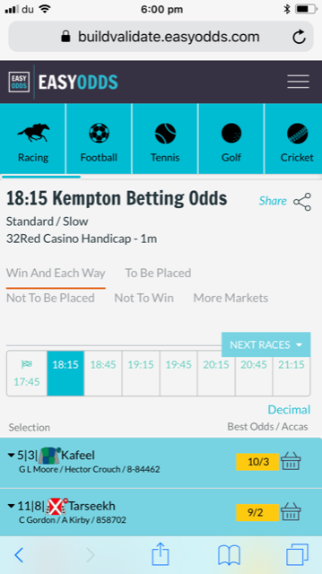
- Only a few types of sports were visible initially when visiting the homepage, all other sports were hidden. First we analyzed which sports were most important for users from analytics data, then we devised a menu system that allowed users to see all of their options should they want something other than the primary selections.
- Odds comparison sites have a lot of functionality from providing Bet Tips, Various types of betting, and offers from bookmakers, so Information overload was one of the principle pain points for users. In order to tackle this problem we strove for a clean solution that guided users through the processes and relied heavily on robust navigation systems.


